Kite blog - All Posts
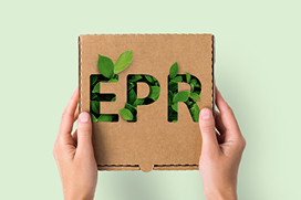
Your Guide to Collecting Packaging Data for Extended Producer Responsibility
Everything you need to know about reporting packaging data for EPR so you can comply with confidence.
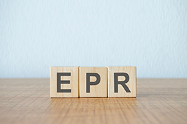
Extended Producer Responsibility in UK Packaging: What Businesses Need to Know
Discover how Extended Producer Responsibility (EPR) affects UK packaging regulations. Learn who it applies to, what you need to report & key deadlines.
Three Questions to Ask Yourself When Buying a Box
Join us we explore three major questions you should be asking yourself when buying a box.
Why Kite Packaging is the Best Packaging Supplier for Your Business
From streamlining supply chains to reducing environmental impact, see why Kite is the go-to supplier for smarter, greener, and more cost-effective solutions.
Last Chance to Buy Packaging for Christmas Deliveries
Order before these dates to get your packaging before Christmas.
What is the Difference Between Blown and Cast Pallet Wrap?
Learn the differences between blown and cast pallet wrap, their manufacturing processes, properties, and ideal applications to make an informed choice.
Peak Packaging Monday
The biggest packaging buying day of the year falls on Monday 25th November
Frequently Asked Questions: Bubble Wrap Packaging Products
Everything you need to know about bubble wrap.
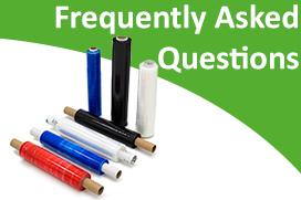
Frequently Asked Questions: Pallet Wrap
Find answers to the most frequently asked questions about pallet wrap.

Eco-friendly Alternatives to Bubble Wrap for Your Business
From hivewrap and shredded papers, to packing peanuts that dissolve in water, discover a range of eco-friendly alternatives for bubble wrap for your business.